01 / Case Study
BioCatch
Turning behavioral biometrics into a category-defining brand.
- Role
- Director, Brand Marketing
- Period
- 2019 – 2021
- Disciplines
- Brand Strategy · Competitive Positioning · Product Marketing · Digital · Creative Leadership

- 150%
- First-year ARR growth after rebrand
- $145M
- Series C led by Bain Capital
- 30+
- New enterprise logos
Context
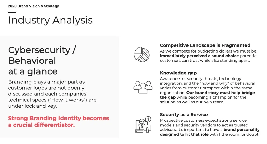
BioCatch had pioneered behavioral biometrics, but the category it invented was barely legible to the people buying it. Awareness of what behavioral did — and why it mattered — varied wildly between stakeholders inside the same prospective customer.
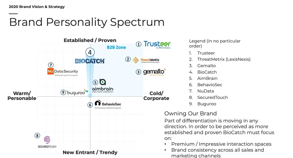
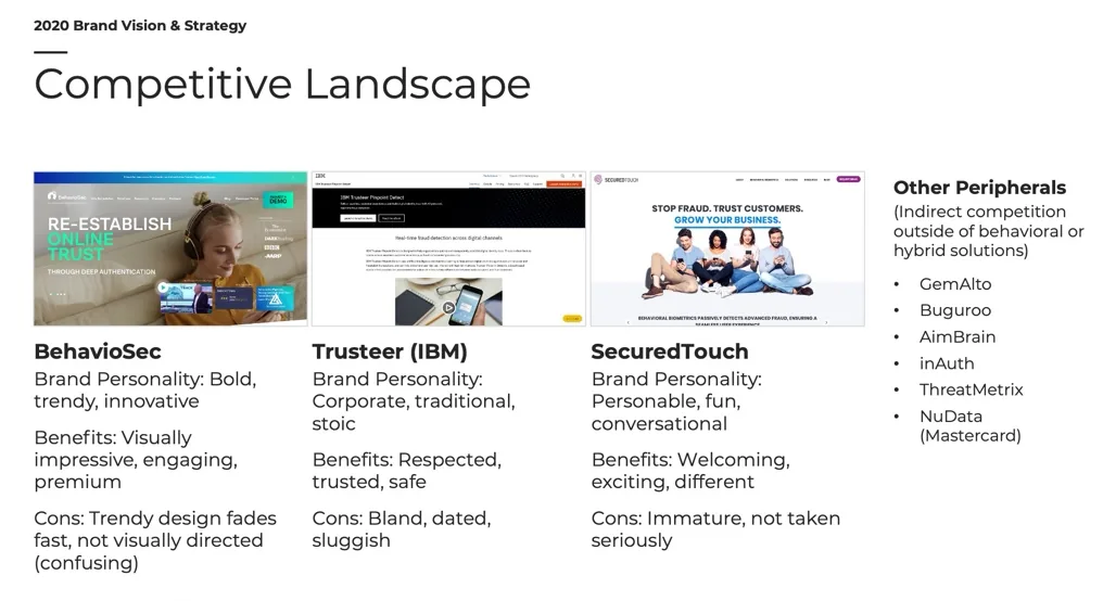
The competitive landscape was fragmented rather than consolidated. Customer logos were not openly discussed, and every vendor kept its technical specs under lock and key. That left very little for buyers to compare on, which made brand identity the actual differentiator rather than a cosmetic layer on top of one.
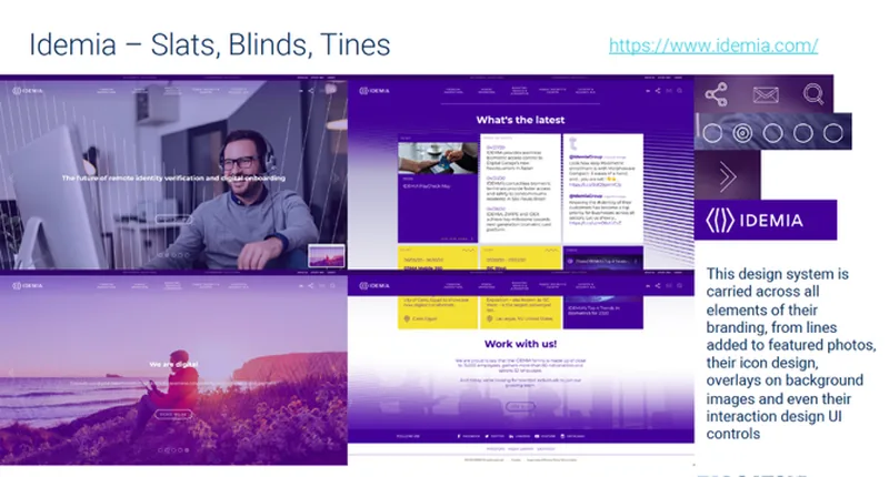
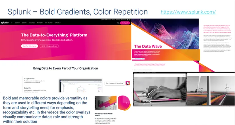
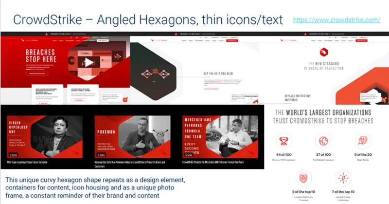
Adjacent security brands had already worked this out. Splunk, CrowdStrike and Idemia were all running confident, highly recognizable design systems. BioCatch was not.
My role
I owned brand definition, competitive differentiation, and product-market positioning, leading a hybrid team of internal operators, vendors, and freelancers.
That covered the research and positioning work up front, the visual identity and design system, the style guide and brand book, channel-specific content, and the rebuild of BioCatch.com as a flagship site on HubSpot CMS — new UX, copywriting, resource library, and multimedia.
Selected work
Reading a fragmented category
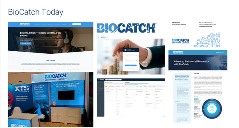
Before proposing anything visual, we mapped where the category actually was: who was perceived as established versus trendy, where the knowledge gaps sat inside buying committees, and what BioCatch looked like next to everyone else.
Borrowing intelligence from adjacent brands
Rather than benchmark only direct competitors, we studied security and identity brands that had solved recognition well, and named the specific mechanic each one used.
Building the identity
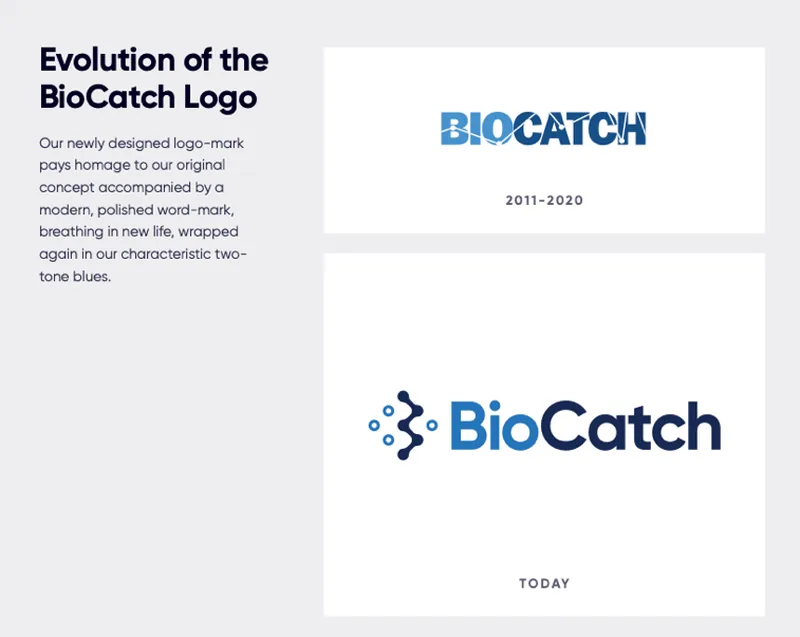
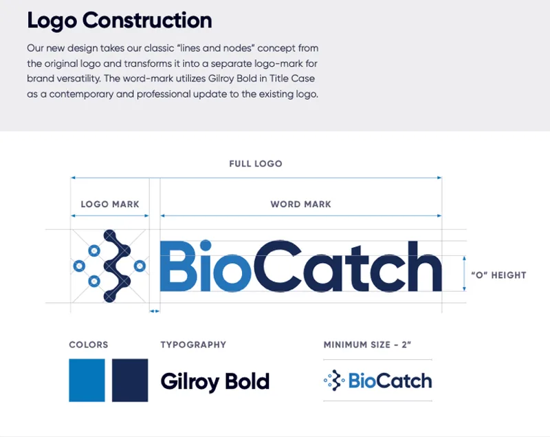
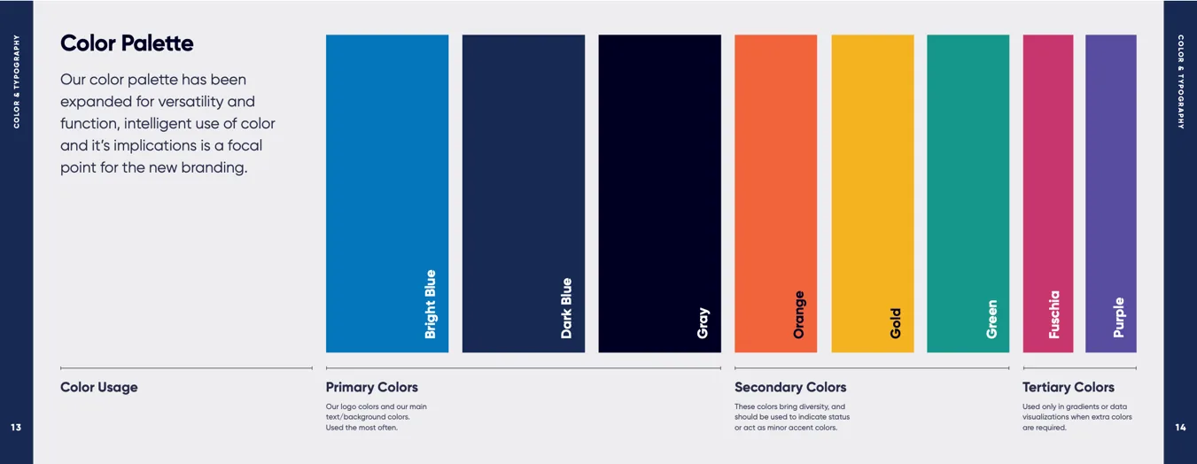
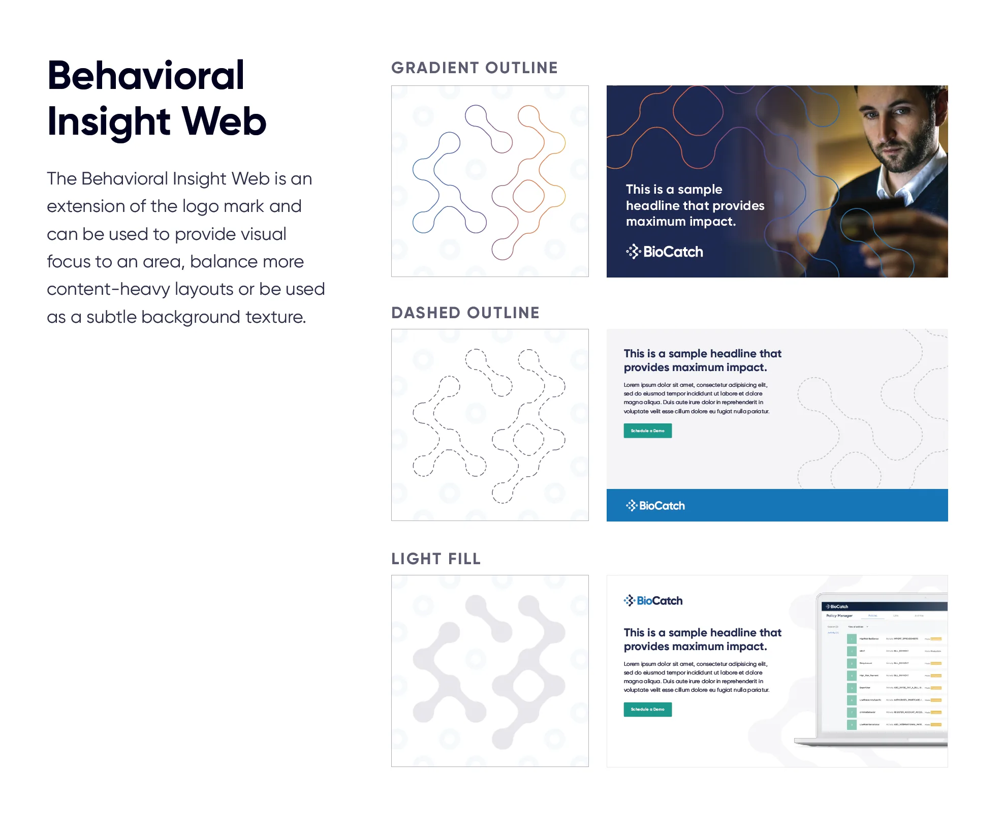
The logo-mark kept the original lines-and-nodes concept and separated it from a new Gilroy Bold word-mark, so the mark could work on its own. The palette was the contentious part.
Defining what the brand believed
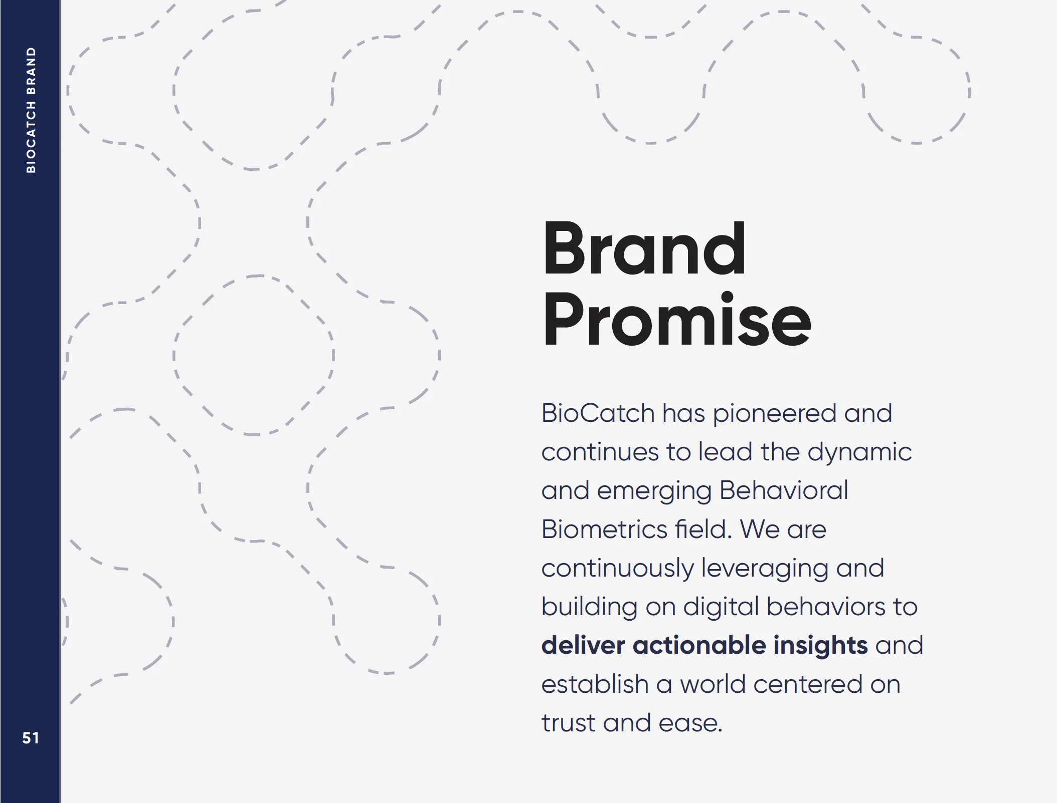
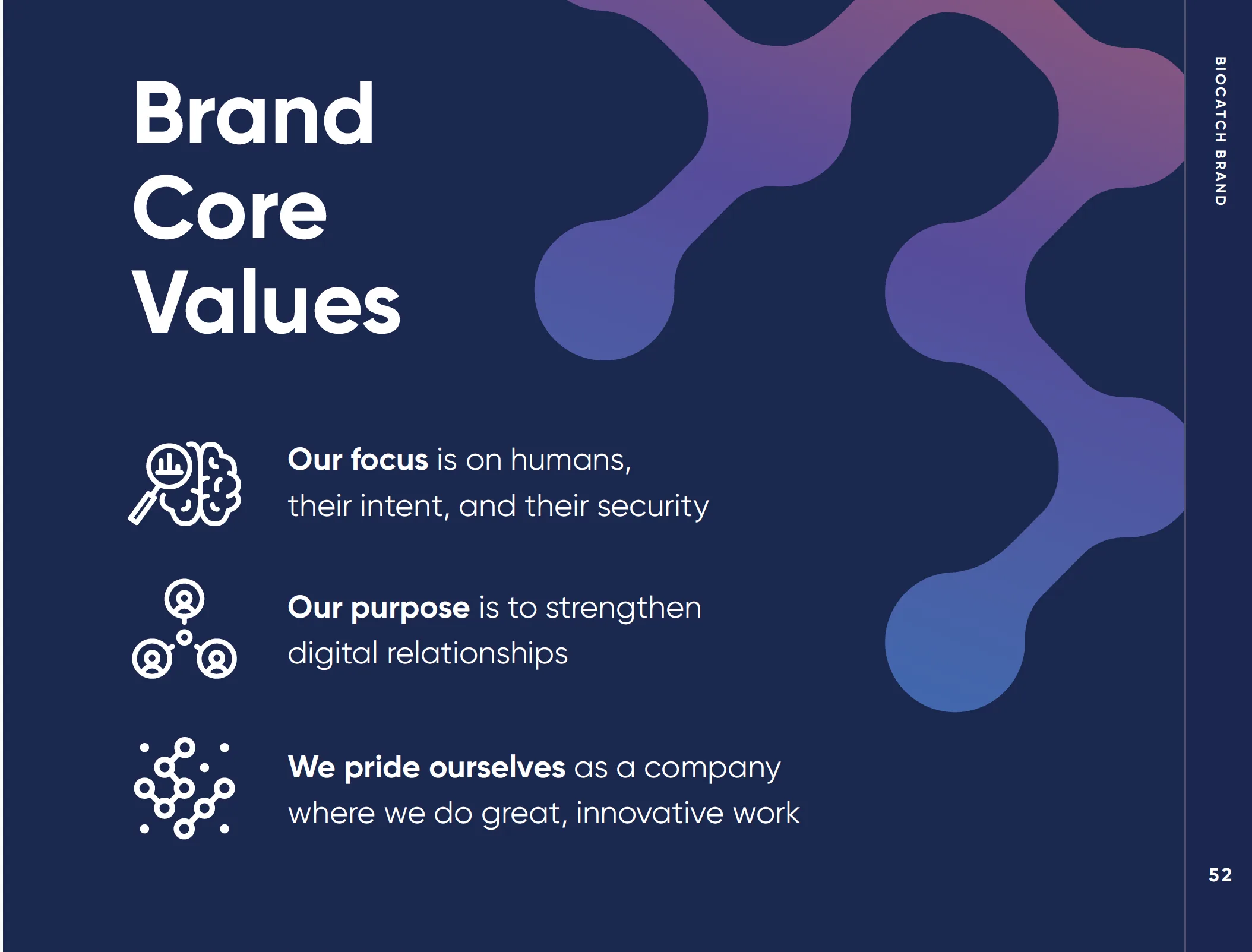
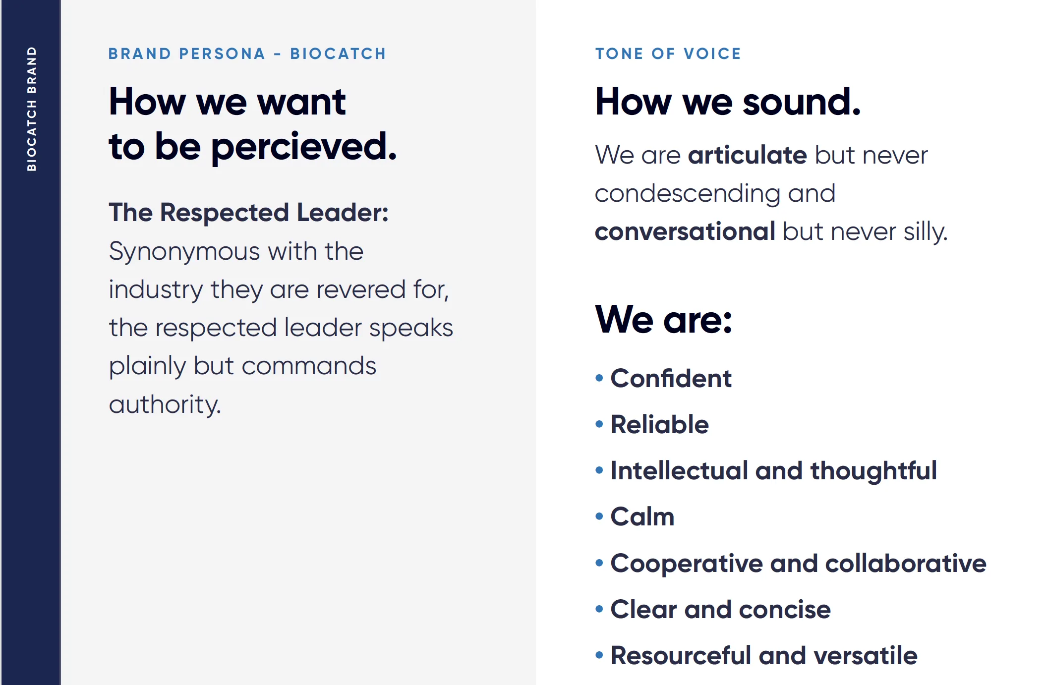
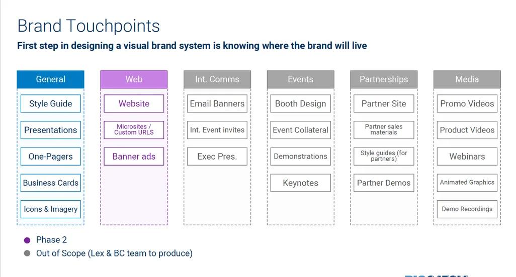
A design system only holds if the language underneath it is settled. We documented position, promise, persona and tone, then mapped every touchpoint the brand would have to live in.

Putting it in market
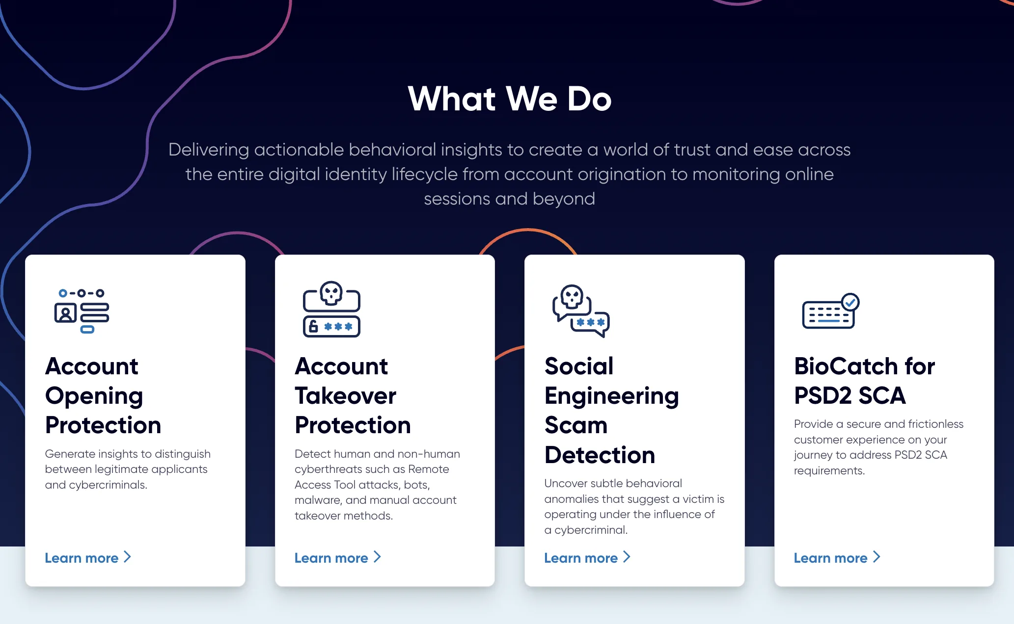
The website was the proof. Technical language was reoriented into common-sense terms, product names and use cases were simplified for industry adoption, and we went after logo rights and testimonials from customers who had never been named publicly.


Before and after
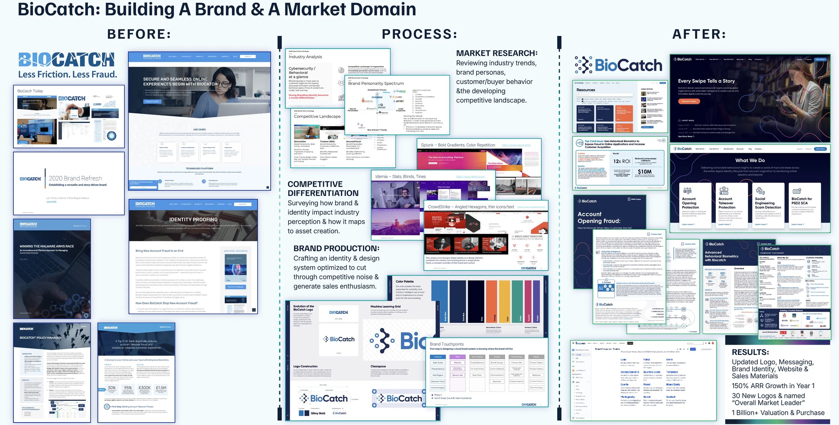
What changed
- The rebrand preceded 150% first-year ARR growth and more than 400% valuation growth.
- The rebrand period coincided with a $145M Series C investment led by Bain Capital and more than 30 new enterprise logos.
- BioCatch.com relaunched as a flagship website on HubSpot CMS with updated UX, copywriting, resource library and multimedia content.
- KuppingerCole named BioCatch Overall Leader in fraud reduction during my tenure.
- BioCatch was acquired in 2024 at a $1.3B valuation.
Looking back
The palette was the argument that took longest to win. Rainbow-sherbet next to two-tone blue looked reckless inside a cybersecurity company, and the instinct in the room was to stay cold and technical. It worked because it made BioCatch legible where every competitor looked identical.
What I underestimated was adoption. Most of the first year after launch went into helping sales, product and partner teams use the system confidently rather than into designing it. The identity was the visible deliverable. Getting other people to reach for it was the real one.